Photographing holo cards without glare
Selling your own cards? A holo photographed badly looks like a damaged card — and a good card photographed well sells itself. This is the exact method we use at the shop, written down by Noor for any collector with a phone and a lamp.
Set the light before the shot
Kill the flash. A built-in flash fires straight at the foil and bounces straight back — that's the white hotspot that eats the artwork. Off, always.
One soft light, off to the side. A window in daytime, or a lamp at roughly 45° to the card. Soft and sideways beats bright and head-on.
Dark, plain background. A dark mat or cloth stops stray reflections bouncing into the foil — and makes the pattern pop.
Tilt the card, not the camera
Tilt the card, not the camera. Rock the card slowly under the light until the holo pattern lights up — then hold it right there and shoot.
Shoot at a slight tilt. A few degrees off square lets the reflection slide off the art window instead of sitting on top of it.
Use the foil pattern. On holos and reverse holos the pattern is the product — a good listing photo shows it sweeping across the card, not hiding from it.
Fill the frame. Card edge to card edge: no sleeve borders, no scanner bed, no background clutter.
Zoom in before you list. Name, set number and HP sharp and readable? If the shot is dark or mushy, retake it — a blurry photo reads as a hidden flaw.
Grader labels, era by era
Grading companies redesign their labels every few years — which means the label on a slab tells you when it was graded, and that has to agree with its cert number. Gauge walks the eras of the big four.
PSA
The classic label. Red-and-white design with the cert number printed right on the front label. Label stock, fonts and the hologram changed several times across these years — two genuine vintage-era slabs can look noticeably different from each other.
The modern label arrives. Cleaner layout, and a QR code plus the “lighthouse” hologram moved to the back of the label, tying every slab to PSA's online cert lookup.
NFC joins in. Tap a phone to a current label and the cert page opens. Cert numbers on modern print runs run far beyond the early series — the number's length itself is an era clue.
CGC Cards
The blue label era. CGC entered card grading with bright blue labels — cert number on the front label, verifiable on CGC's site. Some early tiers printed subgrades on the label.
CGC Trading Cards becomes CGC Cards, with redesigned labels across the board. The top of the scale got its own look: a Pristine 10 wears a gold label.
Cert lookup and population reports live on CGC's site. When you check a CGC slab, the label design has to match the era its cert number was issued in.
TAG
The new kid, built around a QR code. Every TAG label carries a code that opens the card's Digital Report — high-resolution scans of the exact card plus the full score breakdown behind the grade.
TAG uses its own grade names at the top (a TAG 10 comes in Pristine and Gem Mint flavors) — so read the digital report, not just the number on the case.
BGS — Beckett
The color-coded label. Gold at the top — 9.5 Gem Mint and the 10 Pristine — silver at 9, white below. BGS prints subgrades (centering, edges, corners, surface) right on the label, and they're part of the check: subgrades that can't add up to the headline grade are a classic fake tell.
BGS cert numbers appear on the label insert (the back on many eras) and verify in Beckett's online lookup. Match the cert, then match the card inside the case to what the cert describes.
Why the era matters
A slab's label design and cert number have to agree. A brand-new label design carrying an old-era cert range — or a vintage label wrapped around a fresh, ultra-long cert number — doesn't add up, and it's exactly how cloned-cert fake slabs get caught. Counterfeiters copy real cert numbers, so a clean lookup is step one, never the whole check: confirm the card inside the case is the card the cert describes, then compare the label against the right era above.
Learn the fakes we've held
Every pair below comes out of our own checking files: counterfeits that reached this shop in an October 2026 trade lot, caught by our checks and pulled the same night — never listed, never sold. The genuine side of each pair is the official reference image of the real card. Study the difference; it's the cheapest education in the hobby. It's the same checking eye behind Real or Replica, our Pokémon card checker — learn the tells and you'll spot a fake before it costs you.
Try it yourself — the 10-second light test. Hold a card up to a phone flashlight or a bright lamp. A genuine card's core blocks the light — at most you see a dull shadow. If the card glows through, bright and translucent, it isn't real. That test caught the Charizard GX and Salazzle GX below.
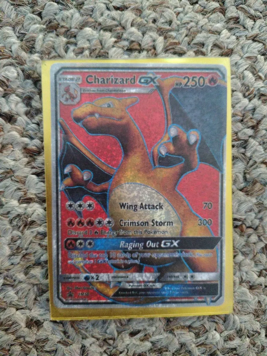 ✕ Known fake — educational sample
Charizard GX · SM60 — the fake
Failed the light test — it glowed translucent. In the photo: a uniform sandy grit covers the whole face, even the flat silver bars that are smooth metal on a real card; the print behind the attack text is muddy and speckled; the tiny bottom print is mush and the Water weakness icon collapses into a blob.
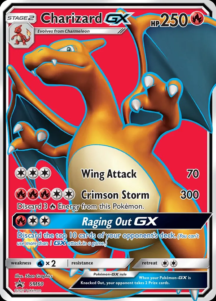 ✓ Genuine — reference
Charizard GX · SM60 — the genuine card
Same card, official reference. The print behind the attacks is a smooth cream-to-gold gradient, the small print is crisp, and the weakness icon carries its detail. Side by side, the fake's grit gives it away.
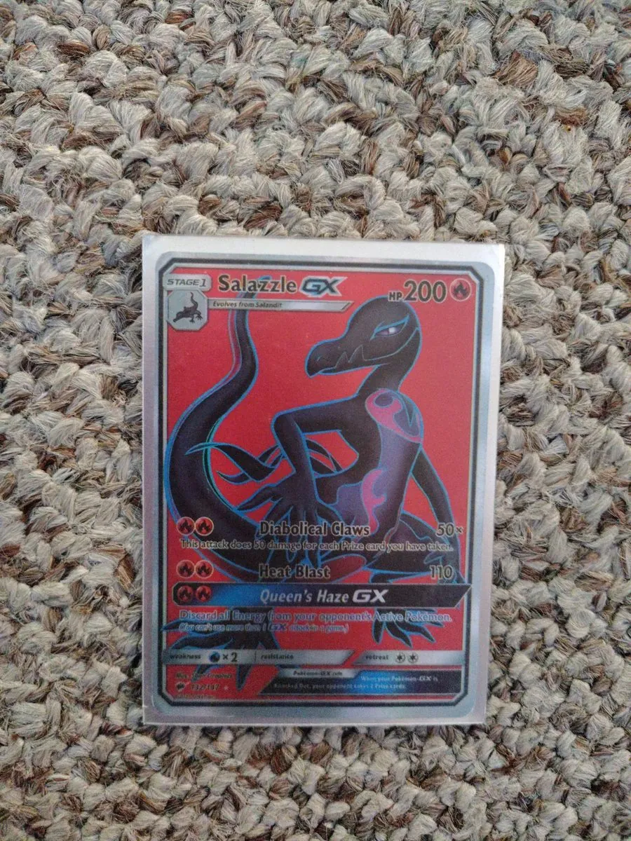 ✕ Known fake — educational sample
Salazzle GX · 132/147 — the fake
The second light-test catch of the lot: held to a lamp, this one glowed straight through. Genuine card stock has an opaque core — a real Salazzle GX held to the same light shows nothing but a dim shadow.
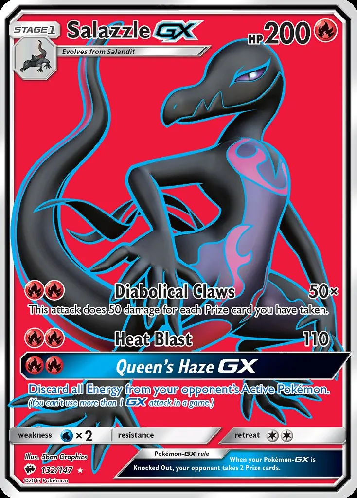 ✓ Genuine — reference
Salazzle GX · 132/147 — the genuine card
The real Burning Shadows printing, official reference. Compare the finish and the print quality — then remember the test that actually caught it costs ten seconds and a phone light.
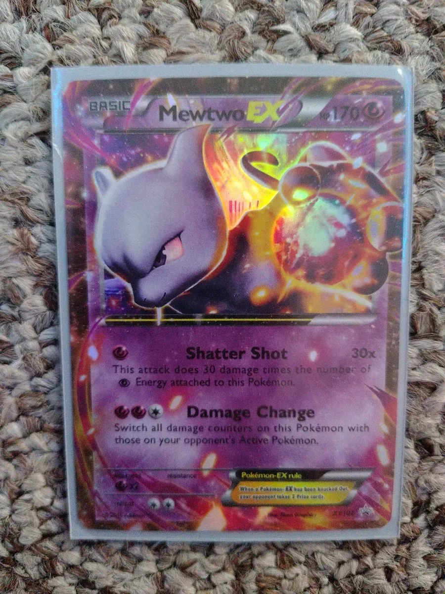 ✕ Known fake — educational sample
Mewtwo EX · printed “XY106” — the fake
Two tells in one card. It failed the light test — and the number is a lie: XY106 belongs to a Gyarados EX. The genuine card with this art and text is XY107, a full art; the fake squeezes that art into a half-art frame. A number that doesn't match the card is a fake all by itself.
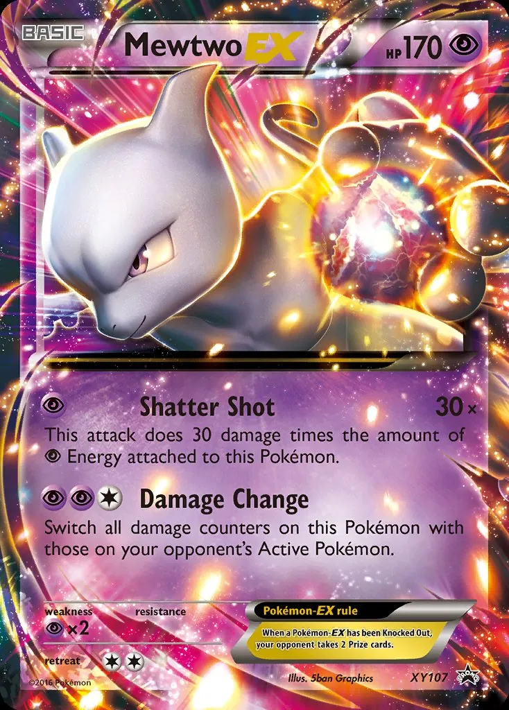 ✓ Genuine — reference
Mewtwo EX · XY107 — the genuine card
The real promo: full art, numbered XY107. When a “rare” card's number belongs to a different card entirely, you don't need a loupe — you need to walk away.
Holo or Not?
Half the questions at this desk are the same one: is this a reverse holo? Here's the tell, the way we check it in the shop — then three rounds to prove you've got it. Tilt the card under a light and look at where the shine lives.
🔄 Reverse Holo
The shine covers the whole card body — the set's pattern is woven through the background, and you can see it behind the attack text. The art window itself stays plain.
✨ Regular Holo
The foil lives only in the art window. Below it, the text box is flat, matte cardboard — no pattern, no shine, no argument.
🧊 Not Holo
No shine anywhere — not the art, not the body. Under the light it stays flat and honest. Plenty of great cards are plain; plain is not a flaw.
The sparkle runs across the whole card. Behind the attack names you can make out the set's pattern, woven into the card body itself — but the picture window looks ordinary. What are you holding?
The artwork blazes when you tilt it — stars and swirls in the picture window. But the text box underneath is flat matte, with no pattern behind the moves at all. What are you holding?
You tilt it slow, left and right, under a good lamp. Nothing catches. The art is flat, the body is flat, the whole card just sits there being cardboard. What are you holding?
Score: 0 of 3 rounds settled. Drawn examples, honestly labeled — the real test is your card, a lamp, and a slow tilt. When a listing here says Reverse Holo, this is the check it passed.